


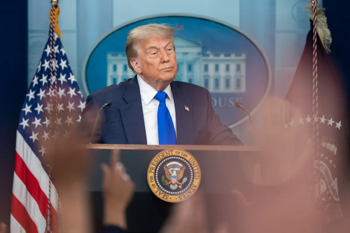
A recent Oval Office press appearance by U.S. President Donald Trump has sparked widespread reaction online, with many social media users likening the event to a scene from a late-night comedy sketch.
On Thursday, August 7, nearly 100 Purple Heart recipients were honored during a White House East Room ceremony. The event, noted for its newly installed gold-themed decor, was briefly overshadowed when the President invited journalists into the Oval Office for an unscheduled appearance alongside Stephen Moore — economist, author of Trumponomics, and senior visiting fellow at the Heritage Foundation.
During this session, Trump, 79, presented several economic charts which he claimed demonstrated strong U.S. economic performance. The charts were reportedly compiled by Moore using unpublished Census Bureau data, making independent verification challenging. The President did not disclose detailed figures or provide broader context for the graphs.
“This one chart really says it better than anything,” Trump remarked while gesturing to one page. “This is great. But this chart is pretty amazing. Right here. All new numbers. Okay?”
The presentation comes amid mixed economic signals. The July jobs report showed U.S. payrolls increasing by 73,000 — well below Wall Street expectations — and inflationary pressures have been rising following the administration’s recently implemented tariffs.
One of the featured visuals, titled Monthly Estimate of Net Change in Real Median Household Income, allegedly indicated that the average median household income — adjusted for inflation — had increased by $1,174 in the first five months of Trump’s second term. “That’s an incredible number,” Trump said. “If I would have said this, nobody would have believed it.”
Online reaction to the appearance was swift. Video clips of the exchange circulated widely on X (formerly Twitter), with viewers comparing it to satirical sketches from Saturday Night Live.
“Holy cow. This actually looks like an SNL skit,” one user posted. Another added: “That’s an amazing chart — look at how that line is growing up and up and up!” accompanied by sarcastic commentary.
A third user shared a still image from the television series It’s Always Sunny in Philadelphia, depicting a crudely drawn bar chart, as a parody of the Oval Office display. Others took a more serious tone, with one noting, “All jokes aside, this is actually frightening when you really think about it.”
The unscripted chart discussion followed Trump’s recent announcement that he would donate his presidential salary to charity. His first paycheck of the term was made out to the White House Historical Association, an organization focused on maintaining and preserving the Executive Mansion.
“Great improvements and beautification is taking place at the White House, at levels not seen since its original creation. MAKE AMERICA GREAT AGAIN!” Trump posted on his Truth Social account.
During his first term, the President donated portions of his $400,000 annual salary to various government departments and initiatives, including the National Park Service, the Small Business Administration, and the Department of Health and Human Services, according to official White House records.
https://www.youtube.com/watch?v=f3IZmZNGNPc
The Oval Office chart presentation — equal parts economic claim, political messaging, and unscripted performance — continues to generate discussion, both for its content and for the unconventional manner in which it was delivered. Whether interpreted as an earnest attempt to highlight economic gains or as fodder for online satire, the exchange underscored the President’s unique communication style, which regularly blends policy claims with highly visual, unscripted moments.

James Jenkins is a celebrated Pulitzer Prize-winning author whose work has reshaped the way readers think about social justice and human rights in America. Raised in Atlanta, Georgia, James grew up in a community that instilled in him both resilience and a strong sense of responsibility toward others. After studying political science and creative writing at Howard University, he worked as a journalist covering civil rights issues before dedicating himself fully to fiction. His novels are known for their sharp, empathetic portraits of marginalized communities and for weaving personal stories with broader political realities. Jenkins’s breakout novel, Shadows of Freedom, won national acclaim for its unflinching look at systemic inequality, while his more recent works explore themes of identity, resilience, and the fight for dignity in the face of oppression. Beyond his novels, James is an active public speaker, lecturing at universities and participating in nonprofit initiatives that support literacy and community empowerment. He believes that storytelling is a way to preserve history and inspire change. When not writing, James enjoys jazz music, mentoring young writers, and traveling with his family to explore cultures and stories around the world.